

Redesigning Algar Telecom’s B2B Portal Around the Way Companies Actually Ask for Help
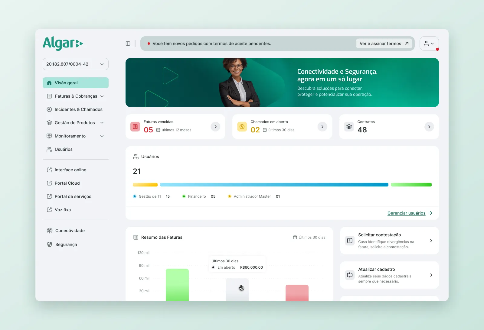
Portal home with the account status bar, invoice charts, quick access and the consultant card.
Overview
Algar Telecom’s corporate customers use the B2B Portal to pay invoices, manage products and get technical support. Many of these tasks still ended up as calls to customer service.
Wave created the Product Concept in 2025. I joined to turn it into a working product: I set up the design foundations, designed the invoice, product, user and technical support journeys, and worked with Algar, engineering and QA from discovery through handoff and validation.
The Challenge
The first release focused on the journeys behind about 60% of customer service tickets. Three problems shaped the work:
- The architecture changed mid-project. The concept assumed a Change Data Capture layer. When the PoC stalled, the team built on Algar’s existing APIs instead (Kenan for billing, SOM and Máximo for tickets). The design had to work around legacy data limits without the user seeing them.
- Dense, high-stakes data. Companies with many CNPJs, dozens of circuits and hundreds of invoices need to find one specific item quickly. A mistake can mean a blocked service or a missed SLA.
- Two clients in the room. Every decision had to work for Algar’s business, legal and support teams and for the end customer, within regulatory rules such as Anatel SLAs.
My Role
I was the product designer on the squad, working with a PM, back-end, front-end and QA, plus Algar’s product and support teams. I was responsible for:
- Reviewing the Product Concept and turning it into a component library and token system ready for development
- End-to-end flows for invoices, products, home, users, technical support and tickets
- Defining behaviors, edge cases and copy, written as specs the engineers could build from
- Running design reviews with Algar, triaging their feedback, and handing off to the internal and partner front-end teams
- Defining the analytics tagging method used to measure the portal
Laying the Foundations First
Before designing any journey, I audited the concept and made the visual language consistent: spacing, colors, border radius and table density. Then I applied tokens to every component, so design and code used the same values from the first sprint.
I also designed the components the concept was missing: date picker, select (including its empty state), counter, feedback messages, and a phone field with country selector and automatic mask by dialing code. Loading, empty and error states were part of the system from the start, not left to engineers to improvise.
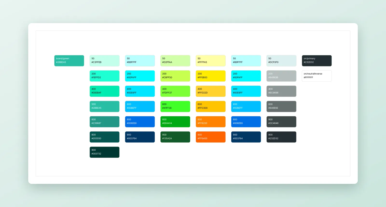
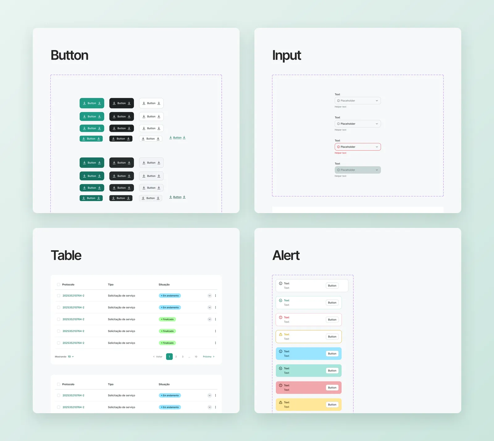
Color tokens and component sheets for buttons, inputs, tables and alerts, with all states.
Key Decisions
1. One message at a time on the home page
The home page could show many alerts at once: pending terms, blocked products, overdue invoices, open invoices. Showing all of them would mean users notice none. I designed a status bar with a fixed priority order. It shows only the most urgent condition and links to the exact tab that fixes it. When everything is fine, it says so.
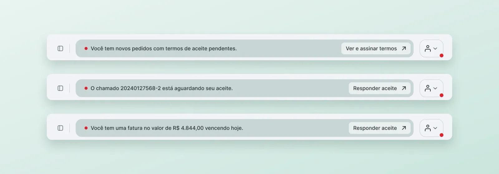
The status bar on three home pages, each showing only its most urgent message.
2. Designing around legacy data instead of hiding it
Building on existing APIs exposed messy data. I designed each case so users could still trust what they saw:
- Zero-value invoices from the billing system couldn’t be filtered out without breaking pagination. They appear as view-only rows, with no bulk selection and no actions menu.
- Child products needed one request per product, which slowed the page and caused errors. I moved them behind an on-demand expand, so data loads only when the user asks for it.
- “Cancelling” products showed up as a separate status, even though the product was still active. With Algar, I changed this to “Active” plus a clear cancellation indicator.
- Contract penalty invoices appear in negotiation but not in the invoice history. I’m designing an explanatory label for them so they don’t look like a bug.
3. Find products by where they are, not by circuit number
Customers said the ticket form was hard to use because it asked for the circuit number first, and nobody memorizes those. People know their services by location. I redesigned the field as an address-first search backed by server-side filtering and infinite scroll, and adjusted the results so long product names stay readable.
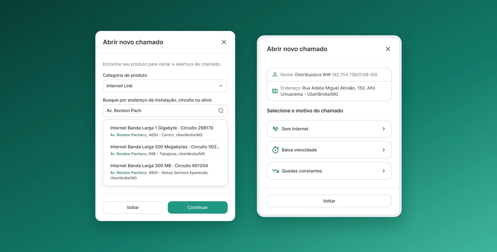
Address-first search in the ticket opening modal, followed by the reason step.
4. Fewer dead ends in technical support
I designed self-service troubleshooting for broadband, fixed line, B2B mobile, neutral network and security products. In the review rounds with Algar’s support team, I simplified the flows:
- Two outcomes (“analysis by an agent” and “technical visit needed”) became a single path, opening a ticket. Visits are scheduled once the ticket exists.
- I reordered the modem reset steps, added a safety warning, and added a speed test step for when the problem persists.
- The confirmation screen now shows the SLA (4h for data incidents, 8h for full voice outages, 5 business days for RFO), which also meets Anatel requirements.
- The RFO flow now asks what an incident report needs: when the failure happened, not business hours. I removed the visit question there.
- A “Are you the technical contact?” checkbox collects the right person’s details when the person opening the ticket isn’t the one who will receive the technician.
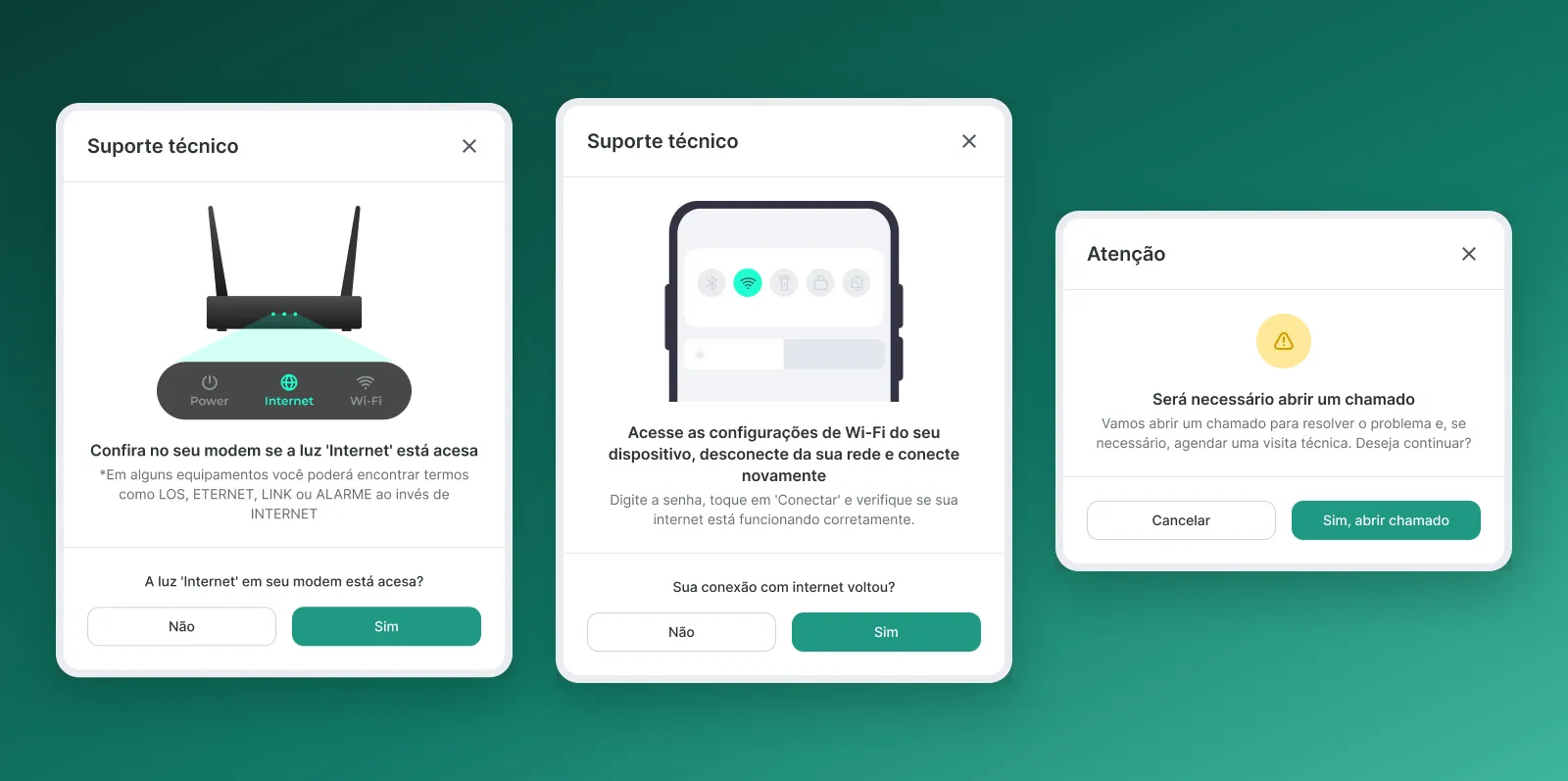
Broadband troubleshooting: modem check, Wi-Fi reconnection and the single path to opening a ticket.
5. Closing the loop inside the portal
Ticket status used to stop at a generic label, and confirming a fix happened only through a WhatsApp link. I designed:
- Plain-language work order stages, mapped from internal SOM codes to customer-friendly copy, in both the list and the detail view
- An acceptance flow in the ticket detail, where users accept or reject the fix, plus the 2-hour auto-close window and a notification that brings them there
- A Location column, visit schedule details and an attachments list, for companies managing many circuits at once
- Mass ticket opening for several circuits with the same issue, limited to the same product category and CNPJ
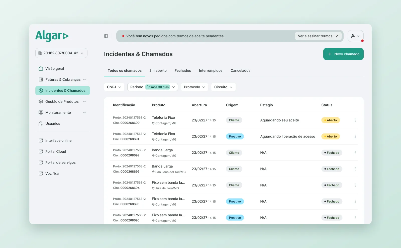
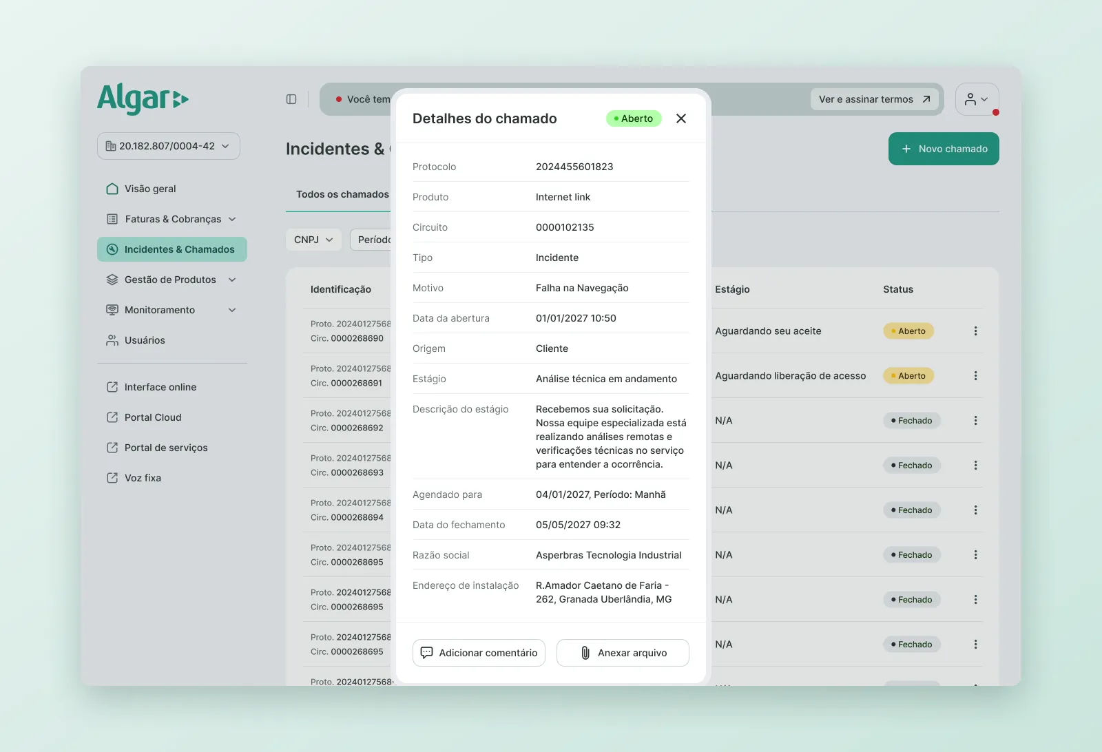

Ticket list and detail with the work order stage, and the acceptance step inside the portal.
6. Making the consultant easy to reach
Algar’s account managers are a key channel, but their button was easy to miss. I redesigned it as a floating card that starts expanded on the first visit, collapses later, and shows the consultant’s email and phone with copy actions. It has a fallback when there’s no photo.
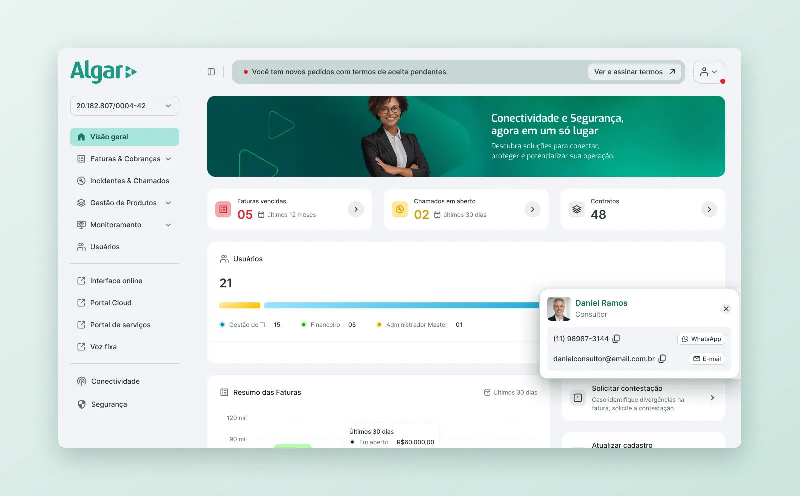
Consultant card expanded over the home page, with copy actions.
Invoice and Product Journeys
For invoices, I designed second copy, boleto, barcode and Pix payment. The actions are ordered by what customers use most. When billing is down, payment options that can’t work are hidden instead of failing on click. Other flows include multiple email recipients, auto-debit activation (the success message explains that the bank still has to confirm), Febraban bulk download, a six-step invoice dispute flow, and debt negotiation. In negotiation, overdue invoices come first, and open invoices can be added only after an overdue one is selected.
For products, I designed change of address, cancellation and pending acceptance terms. I removed an unnecessary token step from the acceptance flow and replaced a 130-option property type dropdown with search.
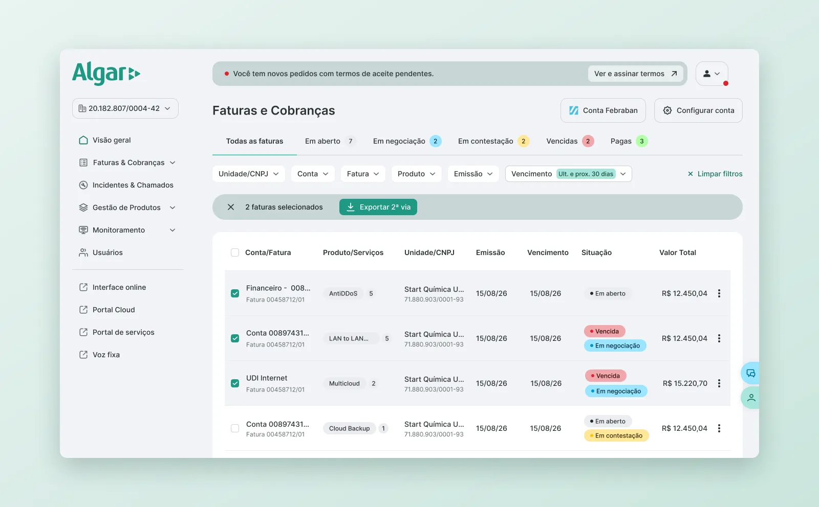
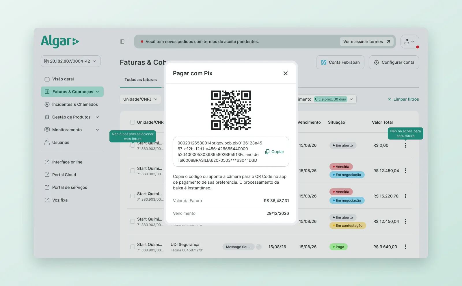
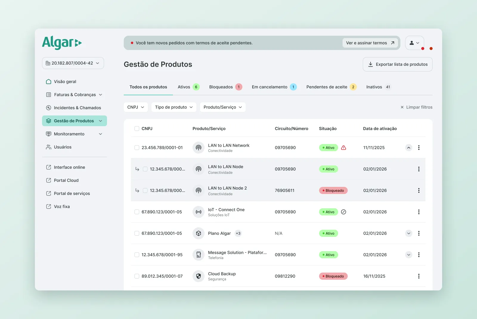
Invoice list with filters and bulk selection, Pix payment, and product management with child products expanded on demand.
Iterating With Algar
After Algar’s internal testing round, I grouped their feedback into clear fixes:
- Applied-filter chips, so users can see active filters without reopening the panel
- Clearer selection feedback when switching CNPJ
- An inline note explaining the 1-year limit on the date filter
- Revised redirect copy that no longer suggested an automatic action
- A tooltip that teaches users how to dispute an invoice when they arrive from quick access
Renaming features (for example, “Contacts” became “Users”) came with in-product info cards, so existing users wouldn’t think something had disappeared.
Prototyping With AI
For the Monitoring module and the role-based home pages (financial, admin and support), I started with wireframes in Figma and then built interactive prototypes with Claude. This let Algar test real interactions before we committed to high-fidelity design, and shortened the time between an idea and a decision.
For first access, I designed a five-step guided tour that points to the main areas of the new navigation.
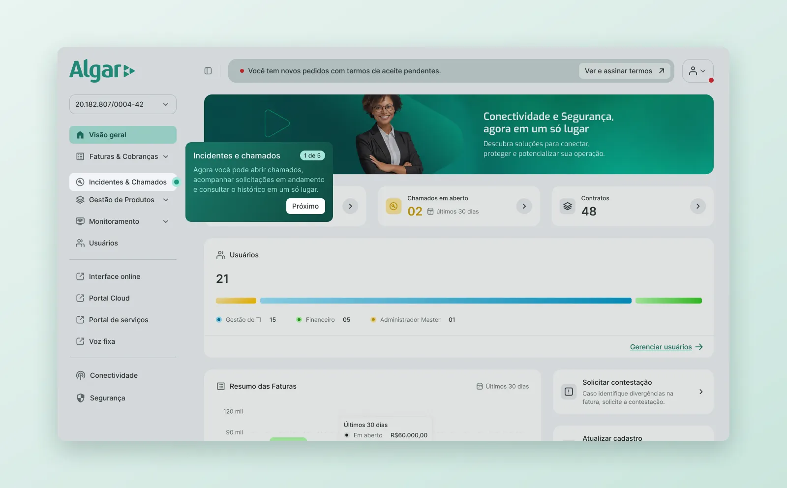
Onboarding tour highlighting Incidents & Tickets.
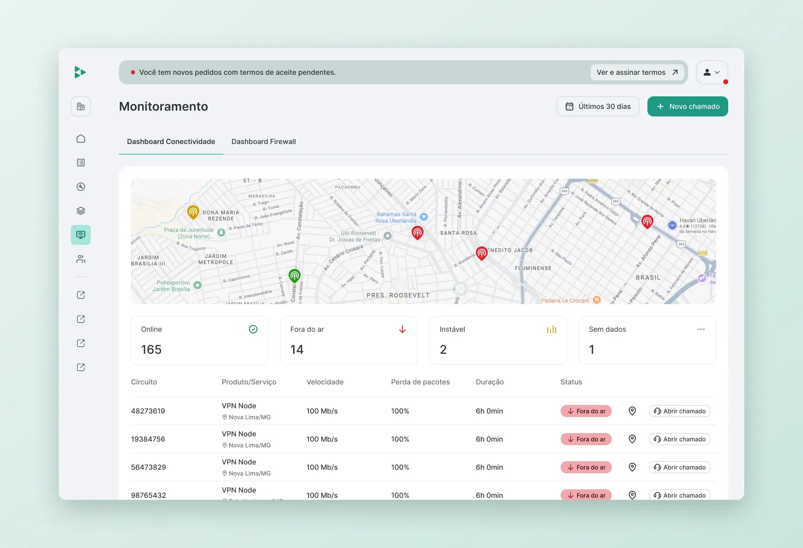
Monitoring module: connectivity dashboard.
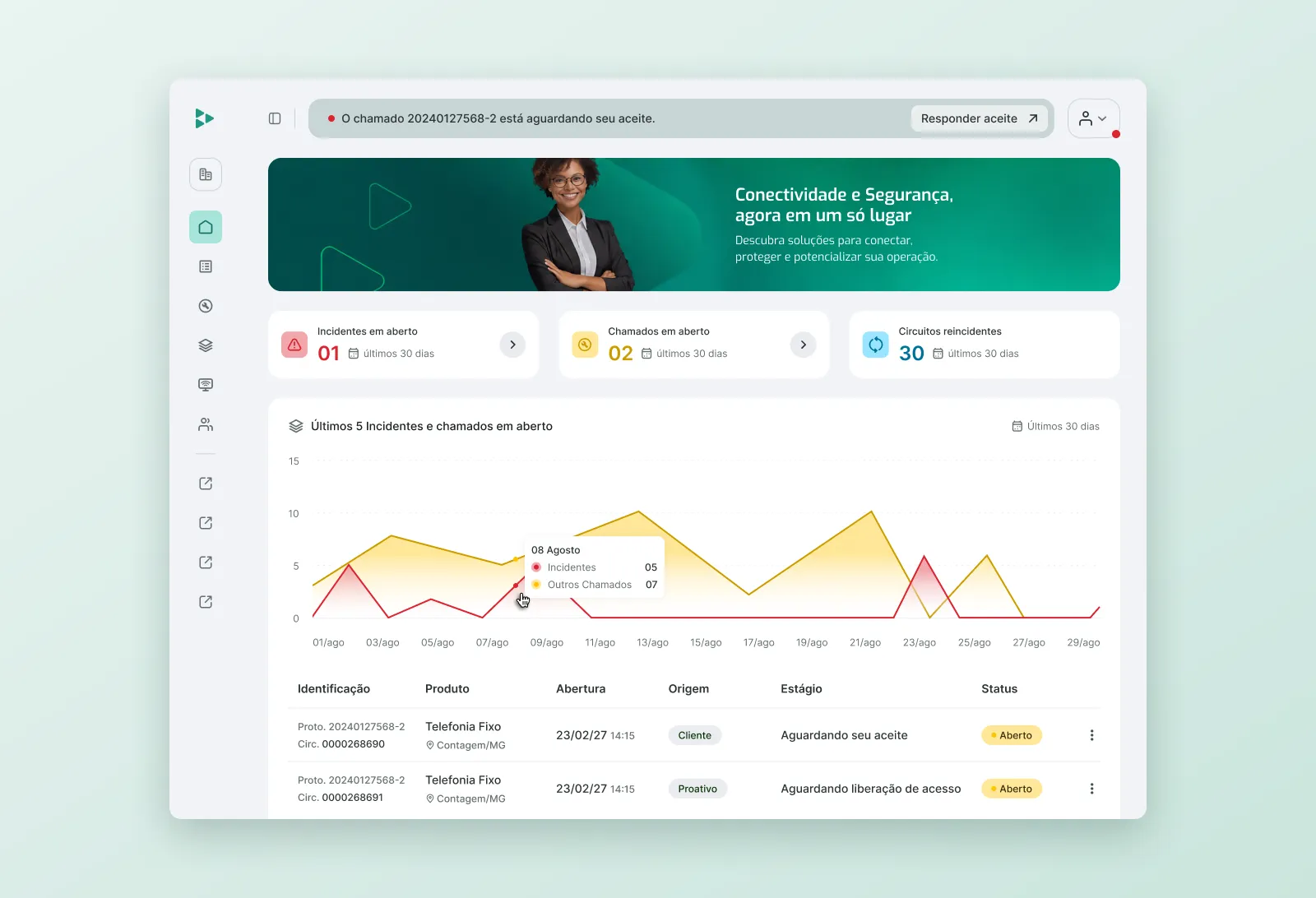
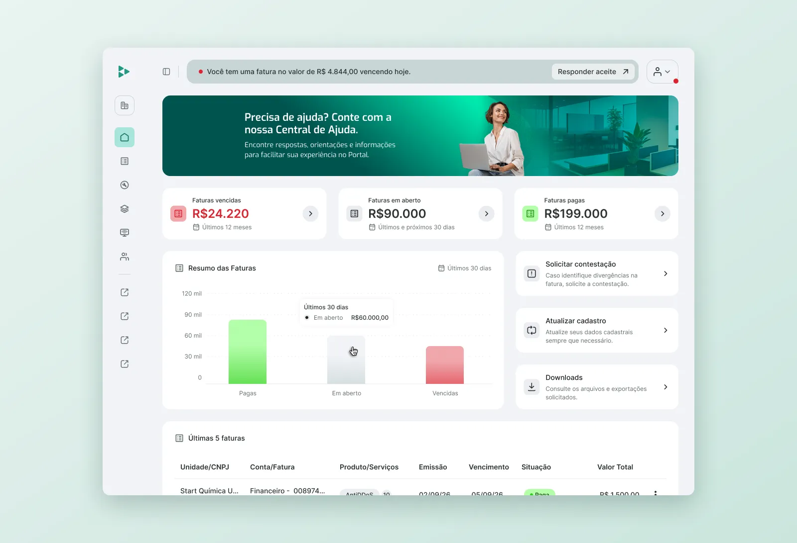
Role-based home pages: support/technical and financial. The admin home opens this case.
Designing for Measurement
I defined the portal’s analytics tagging method and the tags for the home pages, technical support, login and monitoring entry points. Before this, some customers who only used monitoring weren’t being counted at all. With the tags, the team can see whether self-service is actually replacing calls to support.
Results
- The first release shipped invoices, products, home and user management, the journeys behind about 60% of support tickets.
- Technical support, ticket opening and ticket history followed in later releases.
- A shared, token-based component library used by the internal and partner front-end teams.
What’s Next
Next up: reorganizing the menu by category, role-based home pages, the Monitoring module, and access to external reports in the customer portal.