Designing and Scaling Questrade’s
Design System
Overview
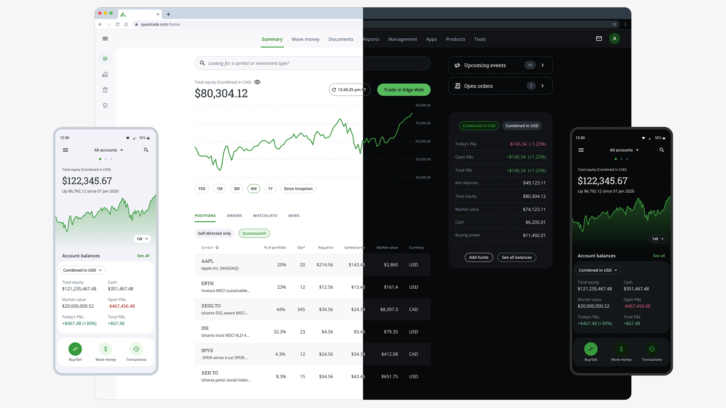
AllSpark is Questrade’s internal design system, supporting multiple product teams. When I joined the team, the system was outdated, rigid, and largely unusable.
Components weren’t built with modern Figma features like Auto Layout or Properties, and they failed to meet basic accessibility standards, including contrast and spacing.
As a result, 71% of components were detached by designers, and developers worked without alignment or guidance — which led to inconsistencies both across different products and within the same product.
I led a full redesign focused not just on modernizing components, but on rebuilding the foundational architecture of the design system — including its structure, scalability, communication, and alignment with engineering.
Internal Research
Component audit
I reviewed over 180 components and analyzed usage patterns across squads. The audit uncovered 42 redundant variants and several legacy components still in use — highlighting a lack of governance and outdated design assets.
Designer and developer interviews
I conducted 1:1 interviews with 12 designers and 5 developers, and ran a survey with an 88% response rate.
Recurring feedback from designers included:
“I don’t know what components are available.”
“I usually end up detaching or building my own.”
“I’m not sure what’s up to date or maintained.”
Developer feedback
Frontend teams reported that design specs often lacked clarity and frequently didn’t match coded implementations — leading to misalignment and rework.
The Challenge

The most fundamental issue AllSpark faced was a lack of consistency across Questrade’s products. As the company scaled, each LOB began adopting its own design patterns, components, and visual styles. Even within the same product, users could encounter multiple button styles, spacing systems, or layout behaviors depending on the feature or team that built it.
This fragmentation led to
- A disjointed user experience across touchpoints
- Increased design and development time due to duplicated effort
- Difficulty maintaining a cohesive brand and UI identity at scale
Objectives
After diagnosing the core issues through audits, team interviews, and workflow analysis, I defined five strategic objectives to guide the redesign of AllSpark. These objectives addressed both usability gaps and organizational misalignment:
- Build a unified design system that could serve all lines of business and products at Questrade — enabling visual consistency, reducing fragmentation, and strengthening the brand across the entire experience.
- Rebuild the Figma library using modern features (Auto Layout, Component Properties, Variables) to create flexible, production-ready components.
- Reduce component detachment by improving usability, structure, and coverage — making the system usable out of the box.
- Improve collaboration with developers by aligning design tokens, behavior specs, and handoff processes.
- Create clear communication channels to keep teams informed about new components, updates, and guidelines.
- Drive adoption and measure usage, using data to guide improvements and ensure the system meets real team needs.
Results
Figma Library Overhaul

Modern component architecture
- Introduced Auto Layout for better responsiveness
- Used Component Properties to handle variants and overrides
- Applied Variables for spacing, color, and typography
- Consolidated redundant variants, reducing total component count by 33%
- Ensured accessibility standards (WCAG 2.1 AA) were met by default
File and token structure
- Introduced libraries for core UI, data visualization, marketing, and utility tokens
- Implemented naming conventions aligned with codebase standards
- Used Figma Variables to prototype theming and dark mode support
Improved Developer Collaboration

To improve our workflow and reduce disruption to the main library, I introduced a branching model in Figma. Each feature or component update was developed in an isolated branch, reviewed in context, and only merged into the primary file after developer alignment — ensuring stability, visibility, and shared accountability across the team. And more:
Developer alignment process
- Weekly syncs to present new components, answer questions, and flag edge cases
- Created Figma specs that mirrored developer expectations for behavior and constraints
- Partnered with engineering leads to align on design tokens for future Storybook support
Implementation impact
- Developers reported a 75% reduction in time spent clarifying handoff specs
- UI code duplication dropped by 82% in shared component repos
- Teams began referencing design tokens more consistently in implementation
Communication & Documentation
Newsletter
I launched a monthly AllSpark newsletter covering new releases, upcoming work, bugs, and design tips. It had a 75% open rate and 40% click-through to the updated components.
Slack channel and feedback loop
We opened a dedicated channel for bug reports, suggestions, and system questions. I introduced a structured request form and received 32 feature suggestions within the first quarter.
Detailed documentation
All components included usage guidance, visual dos and don’ts, and edge case handling directly inside Figma. A shared Google Site also provided changelogs and onboarding material.
Onboarding and training

- Designed a “Getting Started” Figma template file for new hires
- Onboarding sessions and workshops with over 40 attendees
Tracking AllSpark usage
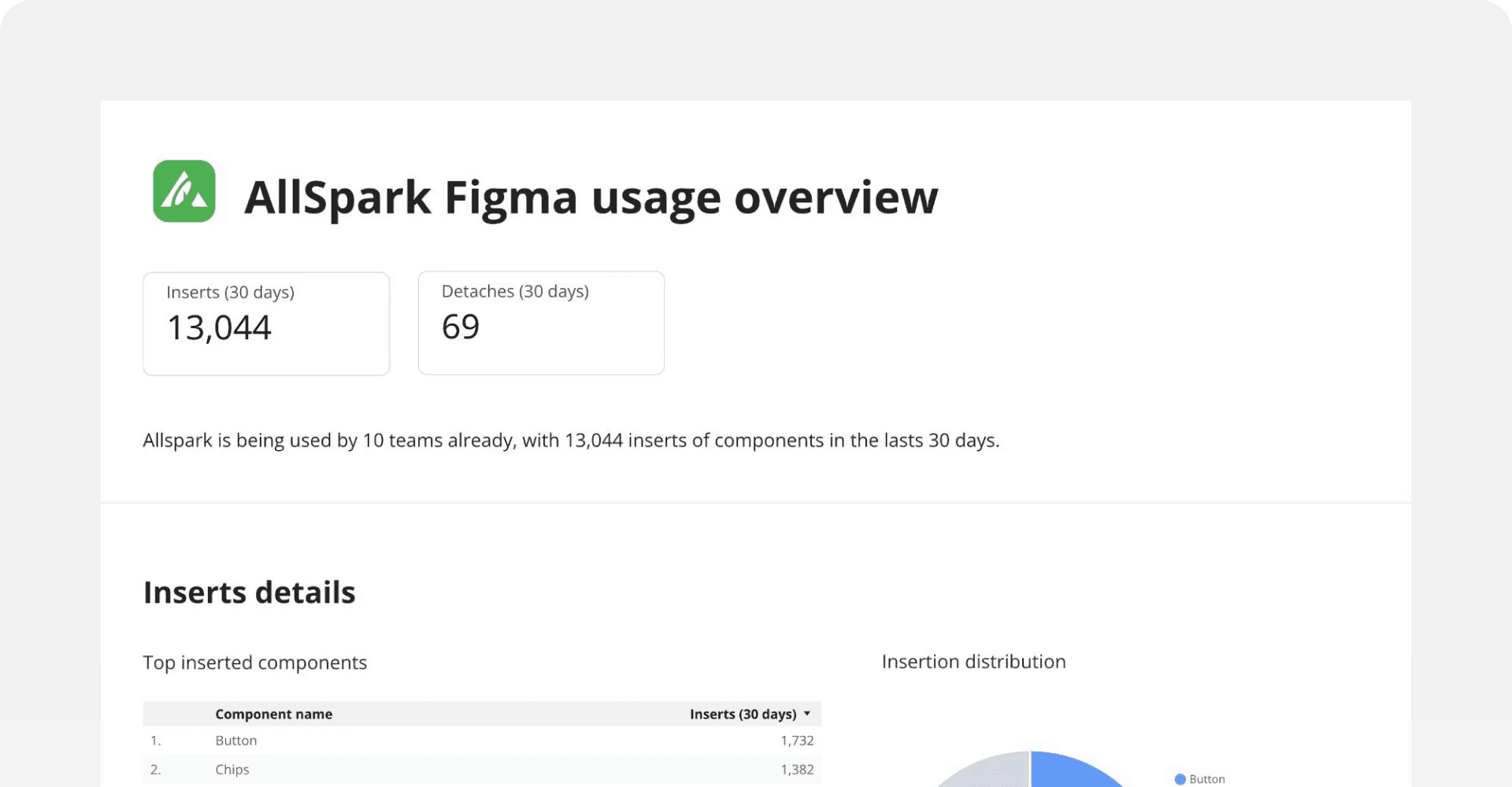
To track adoption and uncover improvement opportunities, I created a custom analytics dashboard that monitored usage metrics such as component insertions, detach rates, top used components, and team-specific engagement. These insights helped guide prioritization and proved the system’s ROI over time.
Measurable Impact
- Reduced detach rate on Figma from 90%+ to 0.53%, aligning design and development through a revamped library.
- Improved customer NPS of AllSpark from 40→80 (Web) and 35→79 (Mobile) over 15 months.
- Supported ~20 product teams across 4 key customer journeys.
- Estimated annual savings: $1.2–1.4M and 17,748 hours, based on QA/Dev/Design resource efficiencies.